
Public sample · AI-generated analysis
Sample onboarding report
A read-only example of a full Flowyce analysis of a nine-step consumer onboarding flow: conversion scorecard, a synthetic persona walkthrough, a Nielsen heuristic evaluation and an emotional journey map — the same sections you get when you run your own product.
All data, scores, charts and findings shown in this section are illustrative examples generated for demonstration purposes only. They do not represent actual client results and do not constitute a guarantee of any future performance or outcome.
OVERVIEW
The flow at a glance
What this tells you: Four lenses on the same flow, summarized into the numbers and issues worth acting on first.
UX Scorecard
73/100
77th percentile · SaaS
Heuristic score
79.5/100
10 heuristics · 9 screens
Persona friction
65/100
4 stall points · goal completed
Projected conversion
4.77%
from 4.5% · +6% lift
Top issues across the report
- 1
Onboarding modals lack visible Back and Close controls, leaving no clear route to revise choices or return to browsing.
User Control and Freedom · Steps 2, 3, 4, 5, 6, 7
- 2
The 'Log in or sign up' panel has no explicit signup button; app acquisition and a separate 'Get started' banner obscure the registration route.
Consistency and Standards · Steps 1
- 3
Users are asked to subscribe without a clear explanation of cost and email-delivery implications.
Match Between System and Real World · Steps 3, 4
All data, scores, charts and findings shown in this section are illustrative examples generated for demonstration purposes only. They do not represent actual client results and do not constitute a guarantee of any future performance or outcome.
UX SCORECARD
Conversion readiness of the landing page
What this tells you: How well the entry page explains its value, builds trust and guides visitors to sign up — benchmarked and translated into projected impact.
UX SCORECARD
Broad review result
OVERALL SCORE
A strong foundation with identifiable conversion friction.
Conversion impact projection
CURRENT STATE
PROJECTED STATE
Potential conversion-rate lift
+0.27 pts
5,000 simulations
Conversion path
18/25The page has multiple, high-contrast CTAs ('Create', 'Get started', 'Get the app') that are clearly visible. However, the path is fragmented as it attempts to convert two different user types simultaneously (readers and writers). This dual focus can create confusion for a first-time visitor, who may be unsure which path is right for them.
Traffic readiness
6/10This page functions more as a content discovery feed than a targeted landing page. Sending cold paid traffic here would be inefficient because of the split focus between reading and creating. To be scalable for paid acquisition, dedicated landing pages for each audience (readers vs. writers) are necessary to ensure message match and a focused conversion goal.
Trust & credibility
13/20Trust is primarily built by showcasing a live feed of content from diverse creators, which serves as powerful social proof. The platform's professional design also lends credibility. However, it lacks traditional, high-impact trust signals like 'As Seen On' logos from major publications, direct testimonials from top creators, or case studies on the main discovery page.
Positioning clarity
15/20The core message of empowering 'independent voices' and content ownership ('You made it, you own it') is strong and clear. However, the primary H3 tagline, 'The app for independent voices,' is slightly vague and doesn't immediately explain what the user can *do* (i.e., read or write newsletters). A new visitor might not grasp the full value proposition within the first 5 seconds.
Lead capture friction
14/15The initial conversion step is extremely low-friction, requiring only a single click on a button like 'Create' or 'Sign up' to begin the process. The page does not ask for any user information upfront, which is excellent for reducing initial user effort and anxiety. The only point of friction is the user's decision-making process, not the form itself.
Top priority fixes
- 1.Deploy audience-specific, dedicated landing pages for paid acquisition to isolate aspiring writers and provide a single, focused conversion goal ('Start writing').
- 2.A/B test a benefit-driven hero headline to pivot from vague positioning ('The app for independent voices') to concrete outcomes ('Start a newsletter, build your community, get paid').
- 3.Implement an upstream self-segmentation gateway for logged-out homepage visitors, explicitly routing them into distinct 'Read' or 'Write' user journeys to reduce pathing friction.
Key takeaways
- Brand positioning around 'creator independence' is a massive strength, but the initial value proposition must clearly define the primary actions (read/write) above the fold.
- The dual-audience layout (readers vs. creators) fragments the initial conversion journey, potentially causing choice paralysis for new, top-of-funnel visitors.
- The platform excels at minimizing friction; single-click entry points without upfront data capture successfully mitigate user anxiety.
- While active community feeds provide excellent implicit social proof, the page is missing explicit, high-authority trust signals like top-tier creator testimonials and media logos.
+1 more takeaway in the full report
All data, scores, charts and findings shown in this section are illustrative examples generated for demonstration purposes only. They do not represent actual client results and do not constitute a guarantee of any future performance or outcome.
SYNTHETIC USER TESTING
How a first-time visitor experiences the page
What this tells you: A modeled persona walks the page, narrating thoughts and logging each moment of hesitation with severity, confidence and a suggested fix.

SIMULATED PERSONA
The First-Time Visitor
65
High friction
1 minute
4
FRICTION DIMENSIONS
What this persona experienced
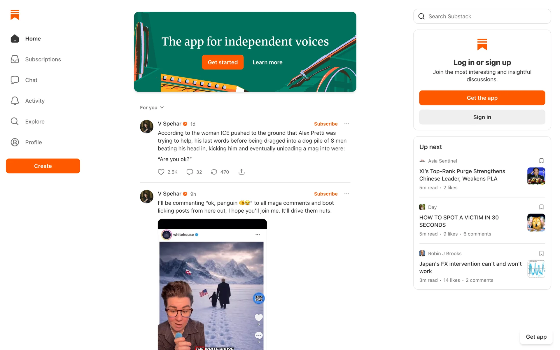
The purpose of the feed was unclear, and several competing sign-up actions created hesitation.
Evidence grounded in the supplied screen and visible interface content.
Friction log
- 00:05Initial page scanmajorConfidence: high
“Is this a news site? Or like Twitter? I'm not sure what I'm signing up for. I was just told to check out the product.”
The page's primary function is not immediately clear. It presents a feed of content without a strong, orienting headline, which can confuse a first-time visitor about the site's purpose.
Add a clear H1 heading at the top of the page that explains the value proposition, such as 'The home for great writing and independent voices'.
- 00:20Looking for how to sign upmajorConfidence: high
“Which button is for signing up? 'Get started' sounds right, but there's another one in the banner. And what's 'Create'? I don't want the app yet. This is confusing.”
The user is presented with several competing calls-to-action ('Get started', 'Create', 'Get the app', 'Sign in') scattered across the page, creating decision paralysis.
For logged-out new visitors, unify the primary CTA. Replace 'Get started' and guide the user towards a single, prominent 'Sign Up' button in the right-hand widget.
- 00:35Focusing on the right sidebarminorConfidence: high
“Okay, this looks like the right area. But I want to 'sign up', not 'log in'. I hope this button doesn't just ask for a password I don't have yet.”
The text block title combines two distinct user actions ('Log in' and 'Sign up') instead of presenting them as separate options, causing slight hesitation.
Separate the actions. Change the headline to 'New to the product?' followed by a large 'Sign Up' button, with a smaller, secondary link below that says 'Already have an account? Log in'.
- 00:45Scanning the content feedminorConfidence: high
“There are 'Subscribe' buttons everywhere. Is that how I sign up for the site, by subscribing to someone? I'd rather just make an account first.”
The prominent 'Subscribe' button next to each post can be mistaken for the primary site signup action, blurring the line between joining the platform and subscribing to an individual creator.
For logged-out users, have the 'Subscribe' button first trigger the main site sign-up/log-in modal before completing the subscription action.
All data, scores, charts and findings shown in this section are illustrative examples generated for demonstration purposes only. They do not represent actual client results and do not constitute a guarantee of any future performance or outcome.
HEURISTIC EVALUATION
Nielsen's 10 heuristics across nine screens
What this tells you: Every screen is scored against established usability principles, with findings ranked by severity and linked to the exact screens they affect.
Overall 79.5/100
The desktop onboarding flow provides clear topic selection, useful creator previews, actionable email-error feedback, and a successful transition to personalized reading recommendations. The main friction points are an ambiguous signup entry point, missing visible back/close controls, unclear subscription implications, and optional setup that interrupts the reading goal.
Screens evaluated
Top findings
- 3.1 · User Control and FreedomSeverity 4/4
Onboarding modals lack visible Back and Close controls, leaving no clear route to revise choices or return to browsing.
- 4.1 · Consistency and StandardsSeverity 3/4
The 'Log in or sign up' panel has no explicit signup button; app acquisition and a separate 'Get started' banner obscure the registration route.
- 2.1 · Match Between System and Real WorldSeverity 3/4
Users are asked to subscribe without a clear explanation of cost and email-delivery implications.
- 1.1 · Visibility of System StatusSeverity 3/4
The multi-stage sequence provides no progress indicator or clear distinction between required registration and optional setup.
- 7.1 · Flexibility and Efficiency of UseSeverity 3/4
Profile setup and a blocking app promotion delay the desktop reader's arrival at articles after registration.
Strengths
- The duplicate-email error identifies the exact problem in plain language directly beside the relevant input.
- Visible selection states and the 'Subscribe to 3 and continue' label make creator-selection status easy to understand.
- Layout-matched skeletons communicate feed loading before populated content appears.
Full report includes all 30 criteria with per-screen evidence.
All data, scores, charts and findings shown in this section are illustrative examples generated for demonstration purposes only. They do not represent actual client results and do not constitute a guarantee of any future performance or outcome.
USER JOURNEY MAP
Emotional arc across the nine-step flow
What this tells you: Tasks, thoughts and feelings at every step, plotted as an emotional curve with an opportunity for each moment.
NINE-STEP FLOW
Onboarding journey map
STEP 1
Find signup
TASK
Scan the homepage
THOUGHT
“Which sign-up button is the right one?”
FEELING
Confused by competing CTAs
OPPORTUNITY
Consolidate prompts into one primary CTA
STEP 1
Find signup
STEP 2
Select topics
STEP 3
Select creators
STEP 4
Sign up with email
STEP 5
Fix email error
STEP 6
Fill profile
STEP 7
Skip app download
STEP 8
Wait for homefeed
STEP 9
Read feed
- • Scan the homepage
- • Choose a sign-up entry point
- • Review topic choices
- • Personalize the feed
- • Review suggested creators
- • Choose subscriptions
- • Enter email
- • Review consent
- • Read the error
- • Understand the next step
- • Add profile details
- • Complete setup
- • Review the app prompt
- • Try to continue on desktop
- • Wait for personalization
- • Observe progress
- • Scan the homefeed
- • Open an article
- “Which sign-up button is the right one?”
- “This seems straightforward.”
- “These match my topics, but how do I go back?”
- “Why are the terms already selected?”
- “The message clearly explains the problem.”
- “I just need to finish these standard fields.”
- “Does Continue mean I have to download it?”
- “The skeletons show that it is working.”
- “The feed matches what I selected.”
- • Consolidate prompts into one primary CTA
- • Group topics more clearly
- • Add a Back action
- • Clarify selection requirements
- • Leave consent unselected by default
- • Place a Sign in link beside the error
- • Mark optional fields clearly
- • Use an explicit No thanks action
- • Explain that the feed is being personalized
- • Offer a short, dismissible feed tour
All data, scores, charts and findings shown in this section are illustrative examples generated for demonstration purposes only. They do not represent actual client results and do not constitute a guarantee of any future performance or outcome.
NEXT STEPS
What to fix first
What this tells you: Recommendations from every analysis, consolidated and ordered by expected impact against effort — ready to send to Prioritize.
Add visible Back and Close controls to onboarding steps
Impact: HighEffort: LowConsolidate competing sign-up CTAs into one primary action
Impact: HighEffort: LowAdd a headline that states what the product does
Impact: HighEffort: LowShow progress and mark optional setup steps
Impact: MediumEffort: MediumLeave consent unchecked and explain subscription implications
Impact: MediumEffort: LowReplace the blocking app prompt with an explicit 'No thanks'
Impact: MediumEffort: LowAll data, scores, charts and findings shown in this section are illustrative examples generated for demonstration purposes only. They do not represent actual client results and do not constitute a guarantee of any future performance or outcome.
Review your own product next.
Start a 30-day trial with no credit card required.